
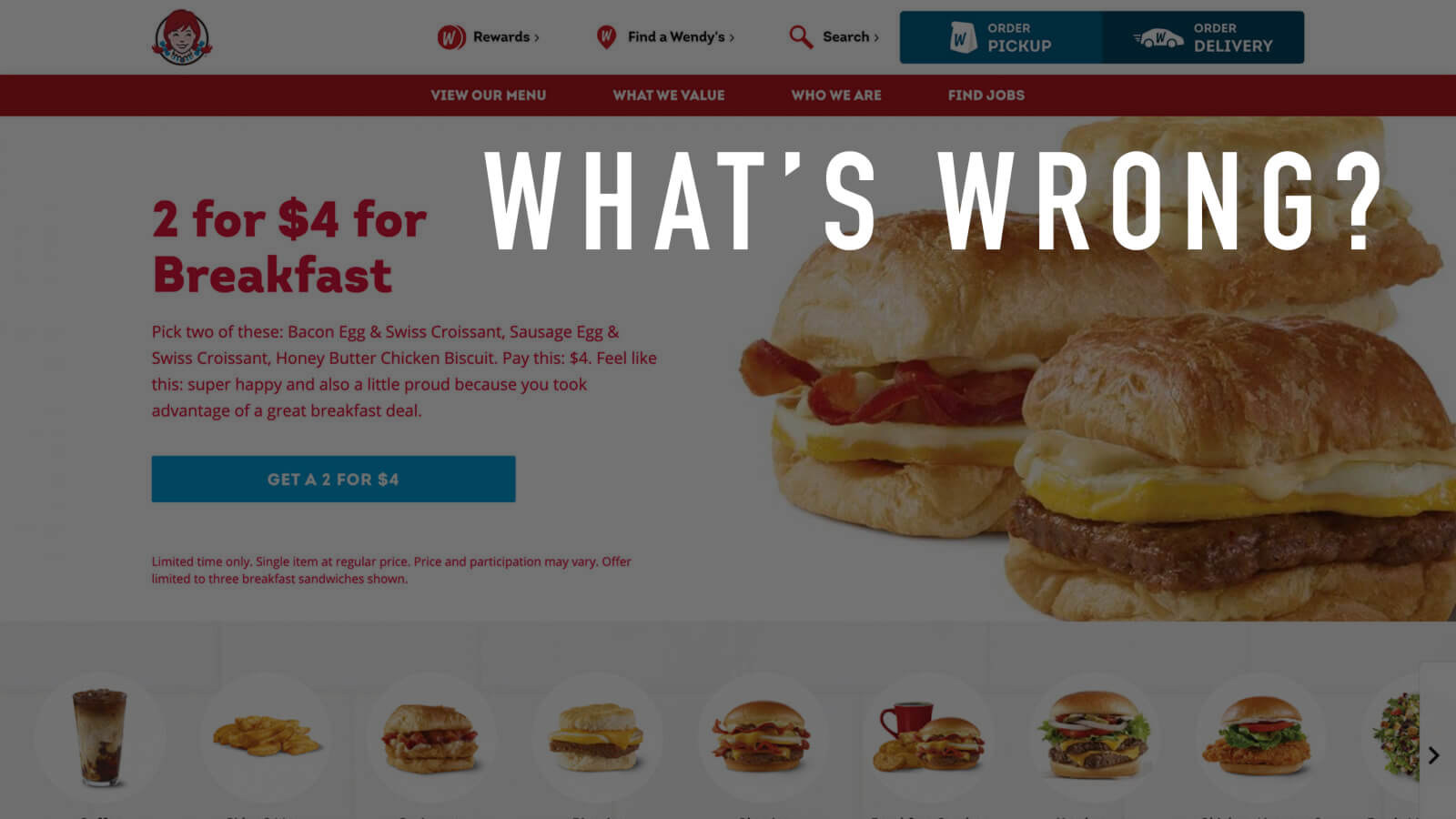
Wendy's is famous for the saying “Where's the Beef?”, but some elements of their July 2021 website homepage left me wondering, “Where's the Wendy's UX team?” Let's take a look at some of the issues affecting this iteration of their homepage, along with possible solutions.
Usability Issues
Issue #1: Privacy banner

Pop-ups and banner notifications are generally an annoyance but are sometimes necessary for communicating important information. The privacy banner for Wendy's, however, specifically states it is for only California consumers. This means 98% of U.S. residents are forced to see something that doesn't apply to them.
Possible Solutions
- Automatically detect location and show the banner to only California residents.
- Make the banner smaller so that it is less obtrusive.
Issue #2: Banner anchor text

The banner uses “here” anchor text, which is nearly always a poor label for hyperlinks.
Possible Solution
Rewrite the text to place the hyperlinks on the important keywords:
Learn details on what personal information we collect and for what purposes, and your privacy rights and how to exercise them. You may submit CCPA-related requests to Wendy’s by filling out this webform.
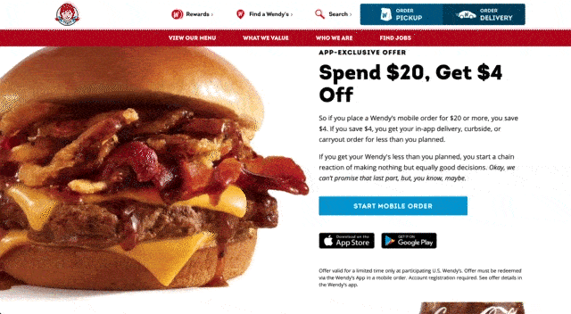
Issue #3: CTA button contrast

The primary CTA button's background color, #029CD4, has a 3.13:1 contrast ratio with the white text, which fails WCAG AA compliance.
Possible Solutions
- Use black text to increase the contrast ratio to 6.7:1.
- Use the darker blue color (as seen here:
 ) for primary CTA buttons.
 - Increase the font size of the CTA text.
Issue #4: Carousel controls
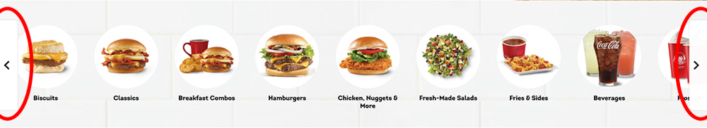
The homepage features a prominent sliding carousel showing the categories of food items. It's a nice visual way to present the menu, but the slider controls violate a key UX principle (Fitts's Law): the left and right buttons are locked on opposite sides of the screen and are only 36 px wide.
In order to alternate movement, the user must drag their mouse across the entire screen each time. The buttons are visible only when hovering over the carousel and the button background has very low contrast, making the controls difficult to see. Users with visual or motor impairments are likely to struggle with this configuration.
Possible Solutions
- Centralize the controls so that the left and right buttons are next to each other.
- Allow the carousel to be moved by clicking and dragging (similar to the mobile controls).
- Increase both size and contrast of the buttons.
Issue #5: Overlapping elements
When shrinking the browser window, text overlaps with the background images until reaching the smallest breakpoint. The text is not augmented in any way to make it legible. As a result, users viewing the page at certain sizes will have a difficult time reading the text.
Possible Solutions
- Adjust the CSS so that elements shift to a single column at a larger breakpoint.
- Add a solid-colored background panel behind the text.
- Shrink the background images further when downsizing the window so that the text stays on its own side of the screen.
Disclaimer: The Wendy's name, logo and website are property of the respective copyright holders. The screenshots used in this review are included solely for the purpose of commentary and critique.
No user interviews or usability testing were conducted for this review. The observations and solutions proposed are solely the opinion of the author in accordance with UX best practices and are in no way representative of Wendy's.