
Shudder is a streaming service for horror and thriller movies. Do they deliver a good online experience, or is the UX of their website the only horror to be found? While the site is visually attractive (if you like horror!) and reflects the subject matter well, it is plagued by several usability issues. Let's break it down and consider some possible solutions.
Usability Issues
Issue #1: Footer link hover color
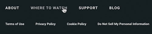

The footer contains two rows of links: the first row functions as secondary navigation — About, Where to Watch, Support, and Blog, while the second row is the legal stuff — the terms of use, privacy policy, etc.
Curiously, the hover color of the legal sections — the links that are typically least relevant to users — is a bold red color. The secondary navigation hover color is a much less noticeable light gray. Based on order of importance, it makes more sense to give the bold color to the secondary nav.
Possible Solution
- Swap the hover color for these two rows of footer links.
Issue #2: Social media icon size
The social media icons in the footer are tiny, with a target area of only 16x19 pixels. It's even more egregious on the mobile version, as the size remains the same! WCAG guidelines state that a target size should be at least 44x44 pixels. There is plenty of space in the Shudder.com footer, so there's no reason these icons can't be bigger.
Possible Solution
- Increase the size of the icons to a minimum of 44x44 pixels and adjust spacing as necessary.
Issue #3: Movie list format
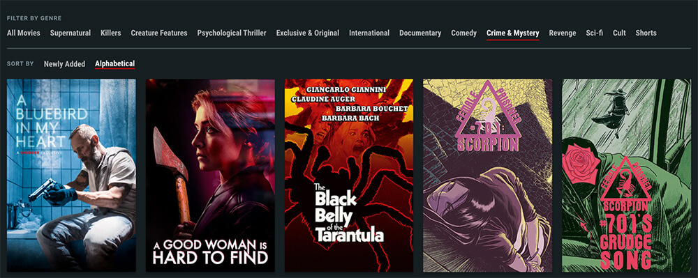
The list of movies is, of course, the central focus of Shudder's content. While the presentation is visually engaging and the format works great for endless scrolling, the downside is that each movie's title is contained entirely within the poster image (see Img 1). The searchable text version of each title exists only as deeply nested <h5>'s within the HTML.
Although this format promotes discoverability, it may hinder findability. If a user is scanning with the title of a movie in mind, and isn't familiar with the movie's poster, it might be more difficult to spot. It's also impossible to do a Cmd/Ctrl+F search on the page to find the title in text format.
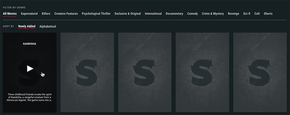
Finally, the lack of text titles means that if the images fail to load (see Img 2), the user is left with a canvas of identical placeholder frames and is forced to mouse over each one individually to reveal which film it is. (Thankfully, alt text is on each image, so screen readers would still have access.)
Possible Solutions
- Add the film title above or below each movie poster image.
- Add an additional view option that provides a text-only list of the available films.
- Have the alt text display on the placeholder frames in the event of a loading failure.
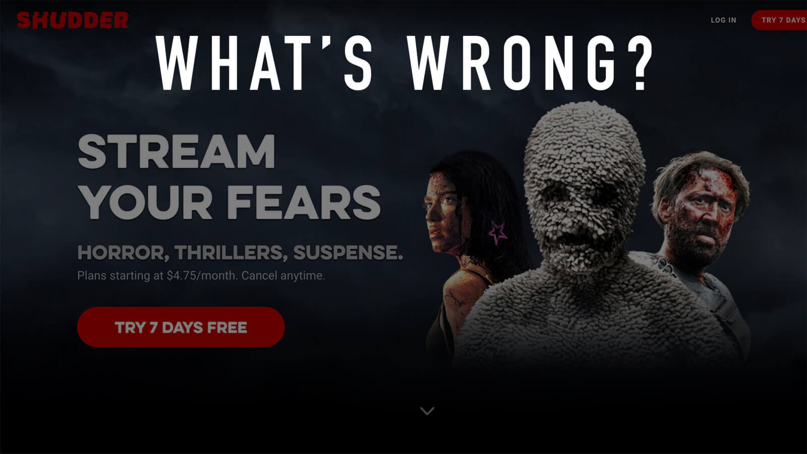
Issue #4: Hidden navigation on homepage
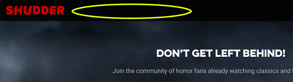
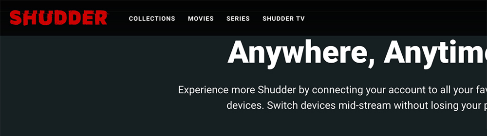
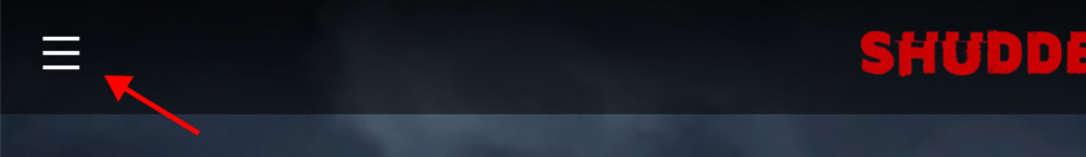
The homepage has no visible navigation when viewing on a desktop display (see Img 1). However, all other pages of the site display the primary navigation (see Img 2). While this trend is apparent on other streaming platforms as well, most have on-page navigation or footer links that lead directly to the content library. In Shudder's case, the Trending Now list is the only pathway that comes close.
Interestingly, this navigation issue affects only the desktop display. Tablet and mobile sizes (1024px or less) of the homepage show the hamburger menu, allowing access to navigate the site:
Viewing the content library is likely the first thing a new user would want. But with no links on the homepage, the only way to find the movie list is to first go to another page to see the navigation — an unnecessary step when there are several ways the homepage could accommodate this.
Possible Solutions
- Add the navigation links to the homepage header menu.
- Add the navigation links to the footer menu.
- Add an on-page navigation section linking to the content library.
Issue #5: No search feature for guests

Guests browsing Shudder.com will find no way to search for a movie. Once you create an account, a search option conveniently appears. This is a classic example of a design tradeoff — stick with a business decision to keep search as a member-only feature, or promote maximum usability by allowing guests to search as well?
I'd go with the user's needs. Guests are allowed to scroll through the library of movie titles — why not allow them to search as well? If they are interested in watching a particular film, doing a successful search for that title may encourage the user to sign up.
Possible Solutions
- Enable search functionality for guests.
- Show the search option to guests, but state that it is a premium feature.
Disclaimer: The Shudder name, logo and website are property of the respective copyright holders. The screenshots used in this review are included solely for the purpose of commentary and critique.
No user interviews or usability testing were conducted for this review. The observations and solutions proposed are solely the opinion of the author in accordance with UX best practices and are in no way representative of Shudder.