
FedEx is one of the top shipping and delivery services in the world. They strive to satisfy customers with their deliveries, but does their online experience satisfy as well? Their corporate website, FedEx.com, appears to mostly deliver the goods. But not surprisingly, I found a few things wrong.
Usability Issues
Issue #1: Subheading hierarchy
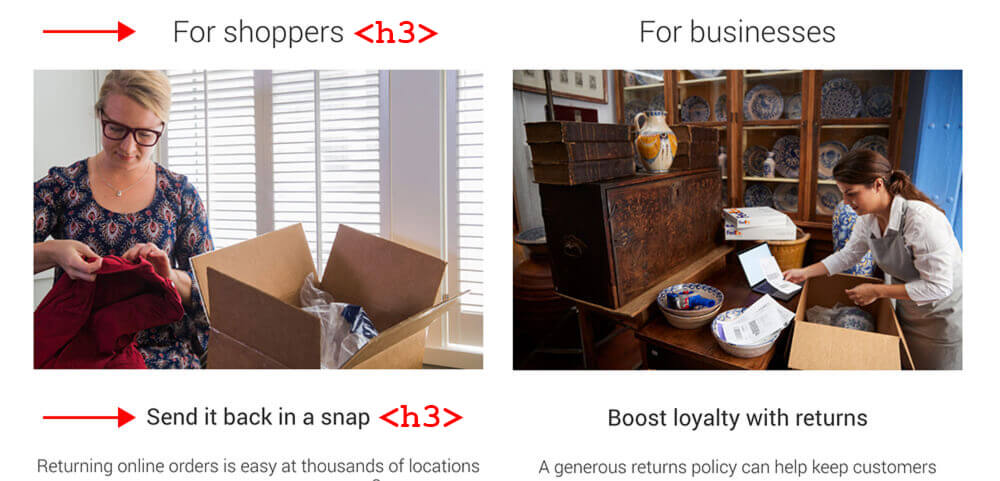
The homepage subheadings do not follow proper HTML hierarchical syntax. To keep HTML as clean and structured as possible, nested subheadings should follow a progressive order:
<h2>Heading 2</h2>
<h3>Heading 3</h3>
<h4>Heading 4</h4>
The Send it back in a snap subheading should use <h4> because it is nested content of For shoppers. Each subheading has different styling as well, which further emphasizes the need to properly define the underlying HTML tags.
Solution
- Change the lower subheadings to use the <h4> tag.
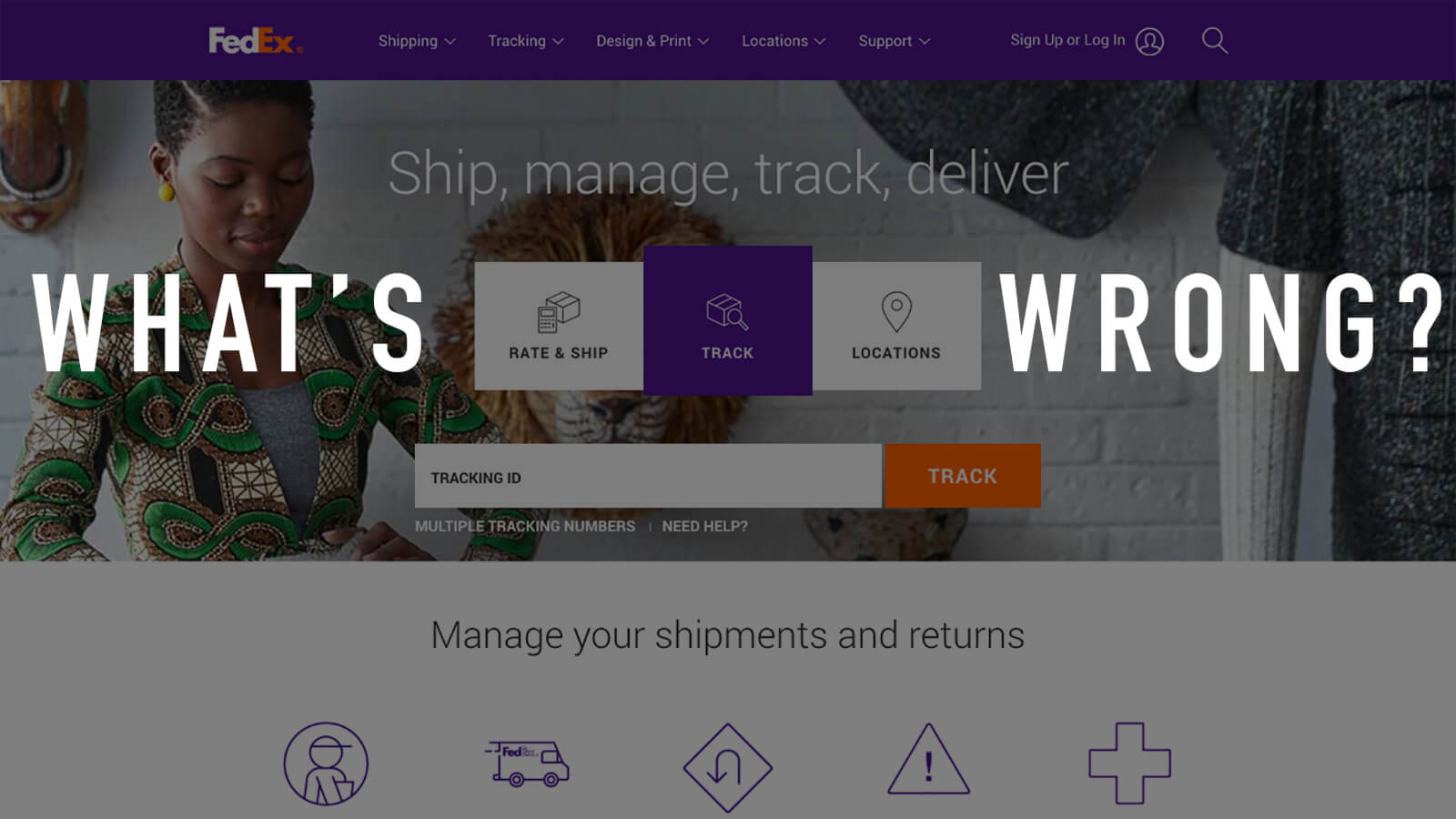
Issue #2: Text/image contrast on homepage hero image

The homepage hero image has a white text overlay (Ship, manage, track, deliver). Because the background image includes a white wall, the text contrast is borderline non-compliant with WCAG standards. Although most users probably won't have issues reading the text, those with decreased vision may struggle.
Possible Solutions
- Darken the background image to increase contrast.
- Use only background images with darker tones.
- Place a solid-colored background container behind the white text.
Issue #3: Gap in icon click target area
The homepage features a set of clickable icons along with hyperlinked text labels. Unfortunately, the icon and text are two separate target areas, leaving an unclickable gap in between.
Possible Solutions
- Increase the target size of the icons to remove the gap.
- Turn each icon/text pair into one tile card and make the entire card clickable.
Issue #4: Missing ALT text on images
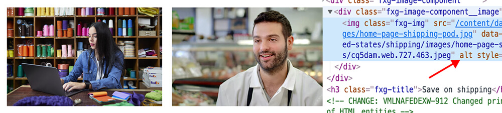
Many images on FedEx.com (primarily the homepage) have no alt text defined, despite having it listed within the HTML. This accessibility issue prevents screen readers from describing the images.
Solution
- Add alt text to all images missing this attribute.
Issue #5: Social media icons are too small
The social media icons in the site footer have a click target area of 30x30 pixels, which is below the minimum value for accessibility purposes (44x44). Curiously, on screen widths of 767px or less, the icon sizes jump to an acceptable 45x45 pixels.
Solution
- Increase icon size to at least 44x44 pixels on all screen widths.
Issue #6: No input restriction on Tracking ID field
The most prominent call-to-action on the homepage is the Tracking ID search for packages. This is a great example of strong content hierarchy. The problem is that the input field has no character restrictions, allowing the user to type unacceptable input such as special characters or extra spaces.
To make matters worse, the system provides no validation or error checking as the user types input. Only after hitting Enter and loading a new screen will the user see an error message. At that point, there is no way to tell whether the error is because of a wrong Tracking ID or because a prohibited character was included.
The best solution to form input errors is to prevent them from occurring in the first place!
Possible Solutions
- Restrict input on the Tracking ID field to numbers 0-9 only.
- Restrict the input character count to the maximum length of a Tracking ID.
- Provide real-time error checking and provide immediate feedback on incorrect entry.
- Provide a tooltip or help text explaining the allowed characters and maximum ID length.
Issue #7: Inconsistent UI actions
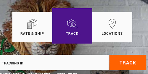

The FedEx homepage places an interactive UI element front and center: three selectable boxes labeled RATE & SHIP, TRACK, and LOCATIONS. The center option, TRACK, is selected by default. The Tracking ID field and CTA button directly below indicate the connection between these elements (Img 1).
Predictably, clicking RATE & SHIP highlights the first box and swaps out the content below with a shipping rate calculator (Img 2).
However, the predictable action of this UI pattern is broken when clicking the third box, LOCATIONS. Instead of highlighting the box and loading new content below, it loads a new page with a completely different interface:
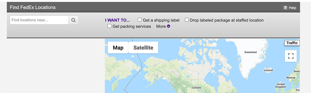
The inconsistent UI behavior creates a jarring and unexpected experience.
Possible Solutions
- Follow the same UI pattern — when a user clicks the LOCATIONS box, stay on the page and load the locations map below it.
- Add a signifier to indicate the LOCATIONS box behaves differently from the rest.
- Redesign the UI element to make the LOCATIONS option distinct from those with different behavior.
- Remove the LOCATIONS box entirely from this area of the page.
Issue #8: Loss of data input when calculating shipping rates
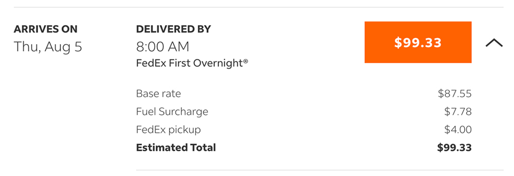
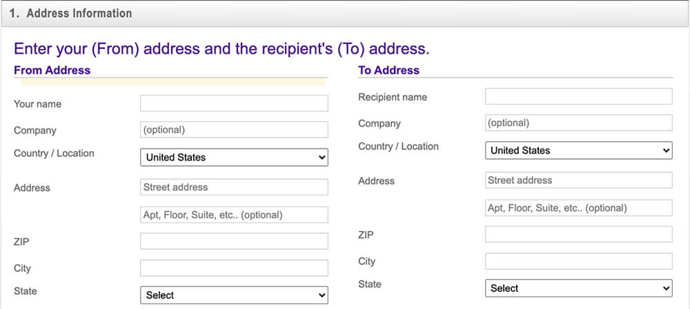
FedEx offers a helpful shipping rate calculator on the homepage. Enter your “From” and “To” addresses, number of packages, package weight, and a few other details, and the site will provide an estimated shipping cost (see Img 1).
But the user experience goes downhill once you hit the price CTA button. It loads a new page and a new form — and none of the previous input is carried over (see Img 2). The address info, package weight, dimensions, and other options must all be reentered*.
Possible Solutions
- Ensure any data entered into the shipping rate calculator is carried over to subsequent forms.
- Complete shipping forms within the same page as the rate calculator.
*Note: After running many tests, the city info did carry over to the second form on several occasions, but most of the time did not. At best, something is not working right with the functionality. In either case, it definitely hinders the user experience.
Disclaimer: The FedEx name, logo and website are property of the respective copyright holders. The screenshots used in this review are included solely for the purpose of commentary and critique.
No user interviews or usability testing were conducted for this review. The observations and solutions proposed are solely the opinion of the author in accordance with UX best practices and are in no way representative of FedEx.