What happens when you are generating leads, but those leads aren't converting?
This is the ultimate conundrum for content marketers. You want your website CTAs to get as many clicks as possible, but if those CTAs aren't the last step of the user's journey, how valuable are they?
My CableTV.com team faced this situation often—our goal was to send traffic to our partners, but our partners didn't just want traffic—they wanted sales. This issue was particularly pertinent for one of our partners, internet service provider Cox.
Our project to address this issue, “Operation Traffic Control,” (OTC) sought to implement measures to better qualify the leads we were sending to Cox. To ensure our proposed changes were effective, I conducted both user interviews and usability testing using guerrilla-style testing methods.
Operation Traffic Control Project Overview
Role
- Interviewer
- Usability test host
- Content Strategist
Process
- Define test plan
- Recruit test participants
- Conduct interviews/usability test sessions
- Analyze results
- Implement changes
Tools Used
- Google Workspace
- Slack
- Zoom
- Lucidchart
Testing Goals
I conducted seven separate user tests as part of the OTC project. This testing combined interview-style questions with several usability tasks on a CableTV.com (CTV) page, in order to gain both attitudinal and behavioral responses from users.
The goal was to learn how users interact with specific pages on CTV, how they respond to CTAs, and how likely they would be to want to click through to a purchase page based on their browsing experience.
Test Objectives
- Are users able to easily find and compare internet plan information for Cox? (following recent changes to the UX of the Cox page)
- Does the information on our geo and provider suite pages inform the user well enough to the point where they would feel comfortable clicking through to make a purchase?
- Do users click on monetized links when they feel ready to make a purchase, or do they use these links for further information gathering?
- Do users understand what will happen when they click on various CTA buttons across geo pages and provider suite pages?
- How do users respond to different CTA labels used for monetized button links?
Testing Method: “Guerrilla” Research
Because this project had no budget, I relied on an alternative tactic to recruit test participants—guerrilla-style research. This is an informal type of research that uses scaled-down methods of traditional UX research to reduce time and cost. Participants can be recruited from various sources, including personal networks, online communities, or “in the wild” (public spaces such as coffee shops, libraries, malls, etc.)
What are some of the pros and cons of this research method?
Pros
- Cheap
- Fast
- Less effort
- Still informative, particularly for high-level testing or early in the research process
- Better than the alternative of no research at all!
Cons
- May be unreliable (bias, shallow results)
- Context issues
- Can’t be used for tests needing highly qualified participants
- Shouldn’t be used for research involving sensitive topics
Pages Tested and Test Participants
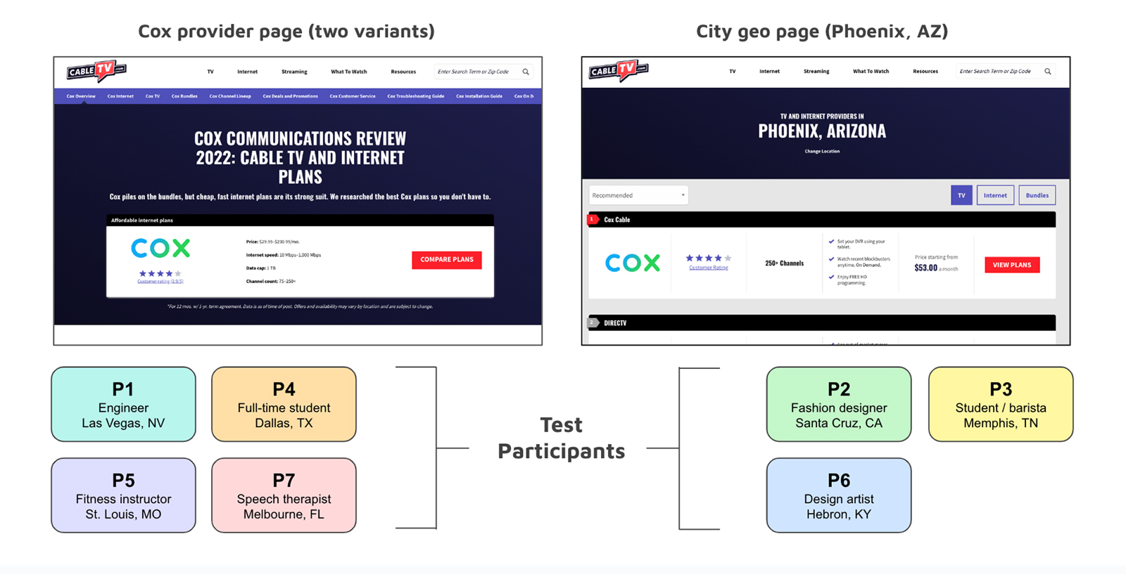
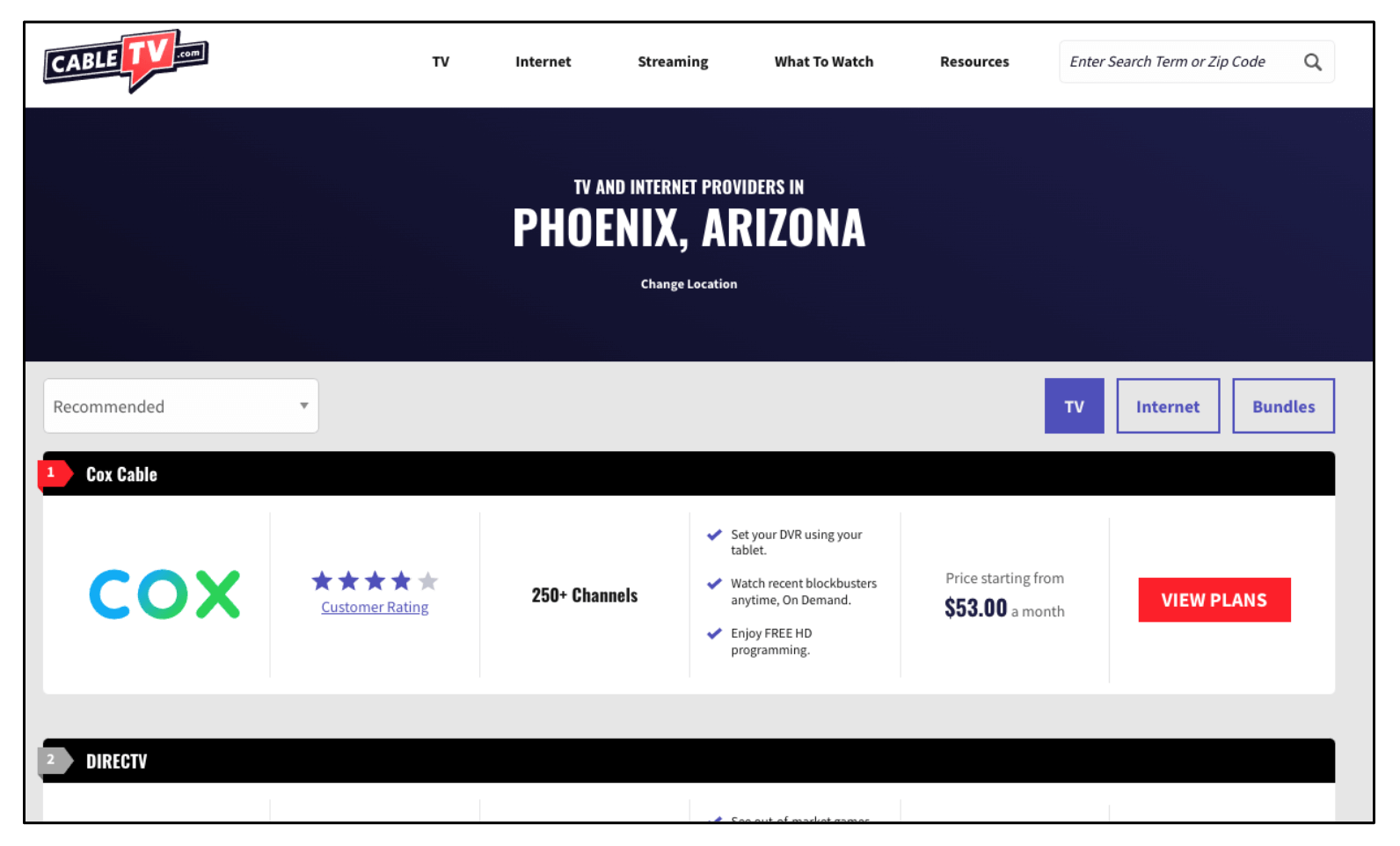
I recruited seven test participants from within my own personal network and one of my Slack workspaces. Three participants tested a city “geo page”, which is a page for a particular U.S. city containing a list of internet providers in that area. The other four participants tested the Cox Communications review page. For the Cox page test, two participants saw the CTA label “Buy Now”, and two saw the CTA label “Buy on Cox.com”.
For the remainder of this report, participants will be referred to as “P” plus the corresponding participant number (i.e., “P4”).
Interview Questions—Answers and Insights
- 86% of participants (6 out of 7) said that reliability was the most important factor when choosing an internet provider.
- Price and speed were the other two most commonly cited important factors when choosing a provider.
- Answers varied widely when it came to how a participant found/chose their internet provider. Responses included:
- Searching on Google.
- Name recognition/familiarity or past experience.
- Limited availability/only option in their area.
- Provider with the best price.
- Recommendations from friends.
- 100% of participants asked (P1 was not asked, as this question was added later) said that having cable TV bundled with internet was not important; several mentioned this was actually a frustration/deterrent when choosing an internet provider. Reasons given included:
- Already have streaming services and don’t need cable.
- Don’t watch much TV.
- Don’t want the extra cost because only internet is needed.
- Two participants mentioned that other services bundled with internet (besides cable) could be an attractive option—services mentioned included a cellphone plan (P5) or a streaming service (P3).

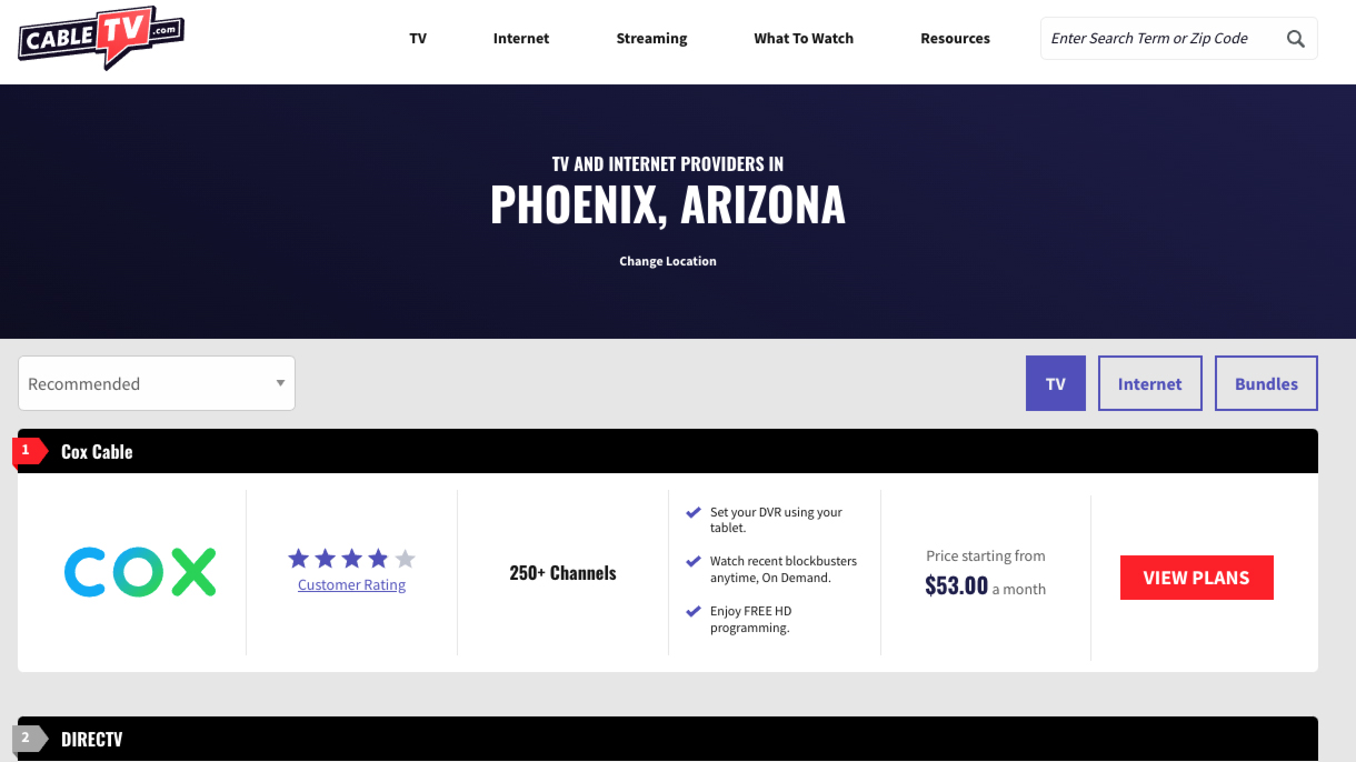
Cox Page—Usability Test Observations
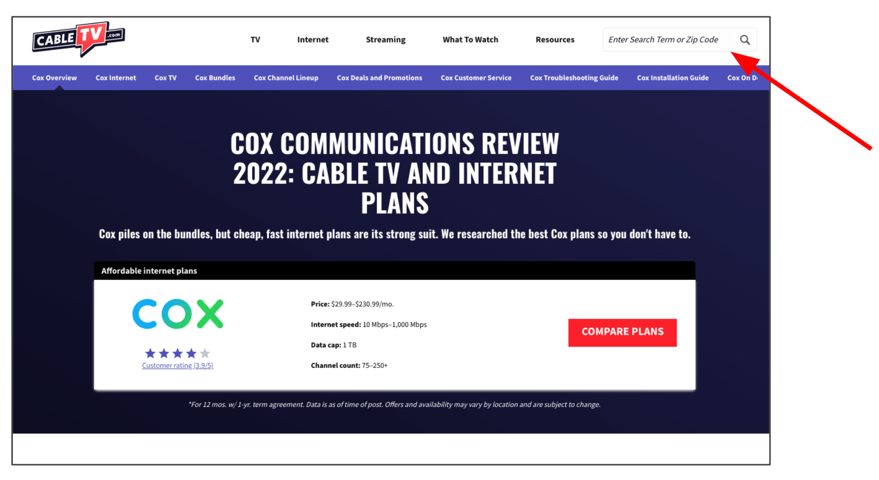
When asked what is the first thing she would do on this page, P4 said she would enter her zip code in the top right corner to find out if Cox was available in her area.
Other first actions mentioned by participants included:
- Examine the rating and other information on the product card.
- Hit “Compare Plans” button.
- Begin scrolling down the page.
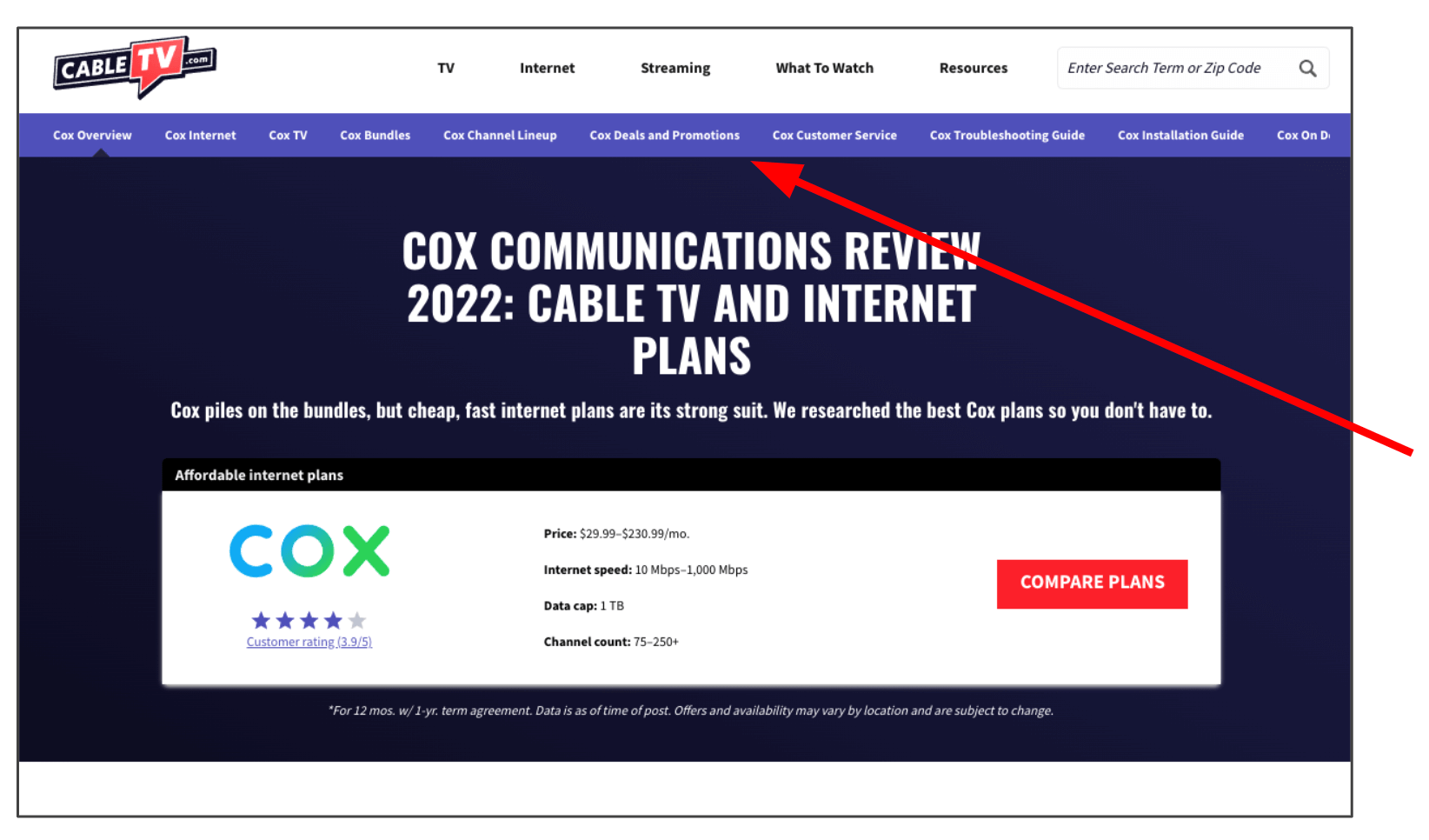
When asked where they would look for more info on Cox services, 75% of participants went to an option in the sub-nav (most commonly Deals and Promotions) rather than scrolling down the page.
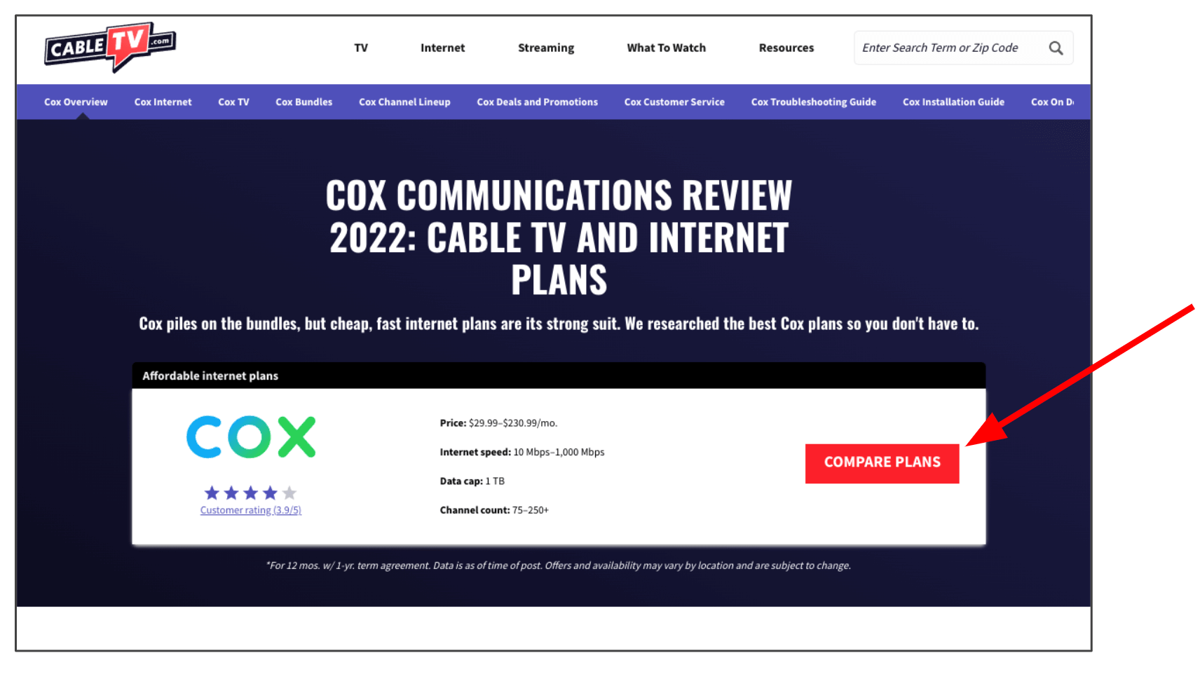
Answers varied when participants were asked what they thought would happen when they clicked the “Compare Plans” button.
- P5 and P7 thought it would open a new page.
- P1 thought a pop-up table would display showing plan comparisons.
- P4 guessed (correctly) that it would jump down the page—interestingly, she guessed this based off of how long the browser scroll bar was.
P7 said she initially thought that “Compare Plans” (CTA button) meant comparing Cox plans with competitor plans.
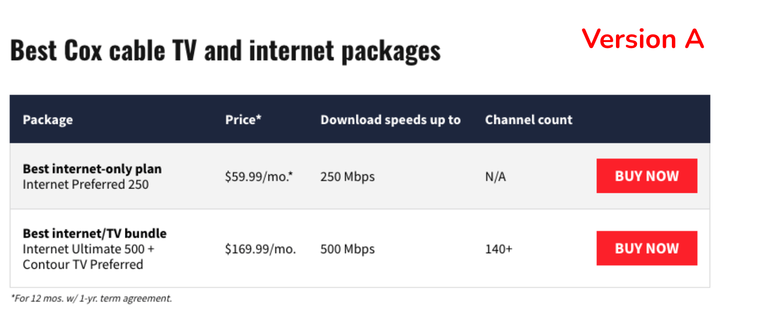
Two participants saw Version A (“Buy Now”) and two participants saw Version B (“Buy on Cox.com”).
Version A
- P4 thought that “Buy Now” would jump down the page to a form to fill out.
- P5 thought that “Buy Now” would take her to a different website with information about that package and if it’s available in her area.
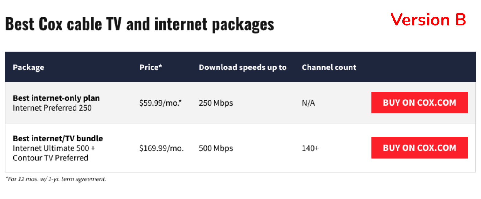
Version B
P1 and P7 both confidently assessed that “Buy on Cox.com” would take them to Cox’s website to begin the purchasing process.
When asked if they would feel comfortable and ready to begin the purchasing process with Cox based on the information presented, 100% of participants said no, they would not yet feel ready.
Each participant mentioned the need to have more information first, including:
- More details of each Cox plan.
- Customer reviews.
- Available promotions/deals.
- Comparisons with other providers.
City Geo Page—Usability Test Observations
When asked what is the first thing they would do on the page, answers included:
- P2 said that he would look at and study what is most visible—in this case, the Cox provider card. He noted that because it is listed first, it immediately has an advantage to him over any other provider listed.
- P3 said that she would check out the number one rated item on the list (Cox) and look at the ratings.
- P6 said he would begin scrolling down, and that his eye went straight to the price listings.
- When asked how they would find out more information about Cox services, 100% of participants immediately chose the “View Plans” button.
- 2 out of 3 participants did not notice or think to change the top tab to “Internet” before clicking the button.
- 2 out of 3 participants expected “View Plans” to take them to a new page.
- P6 thought he would remain on the same page, and noted that he was surprised when it loaded a new tab.
Like with the Cox provider page test, when participants were asked if they would feel comfortable and ready to begin the purchasing process based on the information presented, 100% said no, they would not yet feel ready.
Each participant said they would want to do more research, including:
- Read more reviews.
- Compare Cox with other providers.
- See if other sites make the same recommendations.
P2 noted that he may be prepared to move forward with a purchase from this page, but only if he already had done other research and knew for sure what he was getting.
Other Usability Test Observations
Participants on both page tests were asked what about the page/CTV website made it feel reliable and trustworthy. Responses included:
- The site seems professional and straightforward, which helps with trustworthiness. (P5)
- Having all of the internet packages listed helps show reliability, because it shows CTV has thought about the needs of the customer. (P4)
- The pros and cons being listed from a third party like CTV makes it seem more reliable. (P7)
- Having the reviews/rating listed prominently helps the site feel trustworthy. (P4)
- The official Cox logo helps make the page look legitimate. (P1)
- The ratings being in a prominent place helps it to feel trustworthy. (P3)
- The site looks professional, which helps it to feel reliable and trustworthy. (P6)
Several participants suggested things that would help the site feel more reliable and trustworthy, including:
- Knowing more about who the author is so that you know they are reliable and credible.
- Stating that you did the research and including numbers/stats on this.
- Including more E-A-T (Expertise, Authoritativeness, Trustworthiness) statements.
- Having something like a TrustPilot review/verification on the site.
Quotes

- “We research so you don't have to—that's cool, I like that.” (after looking at the CTV homepage)
- “This [site] would be useful for new homebuyers.”
- “I notice a lot of disclaimers and a lot of text to read.” (on the Cox provider page)
- “I love that there are no ads on the page.”
- “Setting up TV and internet is kind of a chore you have to do, it's not that enjoyable, so I just want to be done with it.”
- “DIRECTV and DISH interest me because there is brand recognition. Cox did, I think just because it's the first one I see.”
- “The top provider card is most visible, so it's everything else versus number one (Cox).” (on city geo page)
- “I research quite a bit—I want to see multiple sites recommending the same service before committing.”
- “This statement definitely makes me trust the site less, but I guess it's good they're up front about it.” (“we may earn money when you click our links” text at top of page)
- “Having an indication of if a provider is good for rural areas would be helpful.” (on city geo page)
- “I was expecting to see a sort by price but it doesn't look like that's an option.” (sort options on city geo page)
Takeaways & Opportunities
Takeaway
→ Internet reliability/stability is highly important to customer satisfaction.
Opportunity
→ Call out a provider’s high reliability record in cards/tables etc.
Takeaway
→ Cable bundles may not be highly important to customers looking for internet service—it may be nice for some, but for others it’s actually an annoyance.
Opportunity
→ Emphasize internet-only options over bundles where appropriate; at minimum, ensure that bundle options do not make it harder to find internet-only plan information.
Takeaway
→ The first provider/provider card listed on a page carries the most weight and may gain an automatic advantage over other listings on the page.
Opportunity
→ Always be strategic with who/what is listed first on a page.
Takeaway
→ The sub-nav on provider pages may be where a user looks first for specific information, rather than scrolling down on the page they’re currently viewing.
Opportunity
→ Be strategic with what options are listed in the sub-nav. Provide multiple paths for users to be able to find relevant information about a provider/plan.
Takeaway
→ If a user enters CTV on a provider page, they likely won’t know whether or not that provider is available in their area.
Opportunity
→ Have zip quals be as high as possible on the page so that users won’t have to guess or use the header zip box, which will add steps to their journey.
Takeaway
→ Unless the label is explicit, users may not be sure whether a CTA will open a new page, generate a pop-up, or jump down the page.
Opportunity
→ Make CTA labels as explicit as possible. Do further research/testing on situations where the best label to use is not as clear. Consider using a new tab symbol on buttons opening in a new tab.
Takeaway
→ The tabbed experience on the city geo pages is not effective, as many users will likely not notice it.
Opportunity
→ Redesign the experience to remove the tabs.
Takeaway
→ Things like E-A-T, third-party verifications/“seals of approval”, and statements about who CTV is and why we’re experts have potential to sway a user’s opinion and convince them to trust us.
Opportunity
→ Highlight our expertise, exhaustive research stats, and other E-A-T credentials even more than we currently do. One participant was particularly captivated by the “We Research So You Don’t Have To” subhead on the homepage—what if we began using something like this phrase on more pages?
Takeaway
→ Users like to research and compare plans among different websites, and likely won’t trust one source as a definitive answer. They also may be entering CTV at different points in their research journey.
Opportunity
→ Strategize ways we can optimize CTV so that our geo and provider pages are useful to serve our visitors best, regardless of where they are in their research journey. Implement ways to better qualify leads before sending them to provider websites.
Revisiting the Test Objectives
Are users able to easily find and compare internet plan information for Cox?
On the city geo page, a definite yes (setting aside the tabbed experience). There was some variation of how the user thought the information would be displayed, but knowing how to get to it was easy.
On the Cox provider page, this was not as straightforward. Users initially looked in several places to find this information, including the sub-nav, the header zip check, and the on-page content. Ultimately, they found what they were looking for, but in some cases had a longer path to get there.
Does the information on our geo and provider suite pages inform the user well enough to the point where they would feel comfortable clicking through to make a purchase?
It’s difficult to give a definitive conclusion here, as the answer really is “it depends.” If CTV is the first site someone lands on when doing their research, the answer is likely no. But if they already have a good sense of what they want, and/or CTV is later in their research process, then yes, we do likely provide the necessary information.
Do users click on monetized links when they feel ready to make a purchase, or do they use these links for further information gathering?
It appears that users are more likely to see the links as further information gathering opportunities rather than initiating the purchasing process—that is, unless the CTA label includes more explicit language (such as “Buy”), in which case there is a better expectation of purchasing.


Do users understand what will happen when they click on various CTA buttons across geo pages and provider suite pages?
They may, depending on the label, but in some cases it’s purely a guess. While there was a general understanding of what type of information a CTA would lead to, there was clearly uncertainty as to the method of delivery (same tab, new tab, pop-up, jump link, etc.) CTA buttons using very explicit labels (i.e., “Buy on Cox.com”) provide little room for ambiguity, but “View Plans”/“Compare Plans” labels do not afford this same level of certainty.
How do users respond to different CTA labels used for monetized button links?
As noted above, labels using the word “Buy” appear to provide better clarity than something like “View Plans” (for CTAs leading to an external provider site to begin the purchasing process). Of the two options used in the testing for the Cox provider page, “Buy on Cox.com” provides stronger information scent than “Buy Now,” and resulted in more user confidence when predicting CTA button behavior.