
Call-to-action (CTA) button labels are crucial for good UX.
An optimal CTA label should be concise, yet descriptive. It should use plain language with strong information scent that clearly informs the user what to expect when they click the button. Labels that are generic, confusing, gimmicky, or overly aggressive can drastically alter your click-thru rate (CTR) and subsequent conversion rates.
On CableTV.com (CTV), our most common bottom-funnel CTA was “View Plans”, a label indicating the internet and cable TV plans users would see from service providers when clicking the link.
I hypothesized that this label may be too generic and that users likely don't understand what exactly is going to happen when they click this link. To investigate the label's effectiveness, I did a competitor analysis of CTA labels and followed it up with A/B testing on CableTV.com to see the impact of alternative labels.
CTA Button Labels Project Overview
Role
- UX Researcher
Process
- Define competitor list
- Analyze competitor CTAs
- Run A/B tests
- Analyze results
- Determine needed changes
Tools Used
- Google Sheets
- Google Optimize
- Mouseflow
Objective
Exploring a holistic approach in which our CTA labels match both page context and reader intent will provide the best experience for our users. For instance, on a low-funnel page, a more explicit and conversion-focused phrase (like “Order Now”) will likely resonate better to the reader, both providing better clarity and encouraging the next step to acquisition.
An analysis of CTA labels from competitor sites uncovers common approaches to this situation and can help inform testing opportunities as well as eventual solutions.
Competitor Sites Analyzed (TV/Internet)

TV/internet review sites
- localcabledeals.com
- allconnect.com
- broadbandnow.com
- decisiondata.org
- broadbandsearch.net
- inmyarea.com
- internetadvisor.com
- bandwidthplace.com
TV/internet provider sites*
- att.com
- xfinity.com
- spectrum.com/internet
- optimum.com
- cox.com/residential/home.html
- verizon.com/home/fios-fastest-internet
- centurylinkquote.com/high-speed-internet
* While the link type and some other factors aren't a 1:1 comparison to our site in the same way the competitor review sites are, provider sites were included in this analysis to get a sense of the types of action-focused CTA labels they use.
CTA Labels Appearing on Multiple Sites (TV/Internet)
| CTA label | # times |
|---|---|
| Check availability | 11 |
| [Phone number] | 5 |
| Order Online | 5 |
| Call to Order | 4 |
| Call Now | 3 |
| Shop [product] | 3 |
| [Phone icon] | 2 |
| Check with [Provider] | 2 |
| Shop [Provider] Plans | 2 |
| Shop Now | 2 |
| View Plans | 2 |
Other CTA Labels on TV/Internet Competitor Sites
Each of the following appeared one time in the analysis:
| [Plan name] | Learn more about [service] |
| [Provider] Details in [zip] | More details |
| [Shopping cart icon] | Move to [Provider] |
| Add to cart | Order Now |
| Build your plan | See Availability |
| Call to Save | See details |
| Details | See Plans |
| Explore [Provider] internet | Shop this speed |
| Get [product] | View details |
| Get it now | View Plan Details |
| Learn More | View Plans & Pricing |
Competitor Sites Analyzed (Streaming)
- cnet.com
- usnews.com
- pcmag.com
- tomsguide.com
- zdnet.com
- techhive.com
- softwaretestinghelp.com
- consumerreports.org
- clark.com
- consumersadvocate.org
- businessinsider.com
- cordcuttersnews.com
- thestreamable.com
CTA Labels Appearing on Multiple Sites (Streaming)
| CTA label | # times |
|---|---|
| Sign Up | 3 |
| [Price] at [Provider] | 2 |
| Check Price | 2 |
| Visit Site | 2 |
Other CTA Labels on Streaming Competitor Sites
Each of the following appeared one time in the analysis:
| See at [Provider] | Start Free Trial |
| See It | View |
| View at [Provider] | View now at [Provider] |
| [Provider] | Sign up for [Provider] |
| [Price] from [Provider] | Start Your Free [Provider] Trial |
| [X]-Day Free Trial | Get [X]% Off |
Competitor Analysis Summary
The competitor analysis revealed a wide range of labels used for CTA buttons on TV, internet, and streaming websites. I was intrigued to find that CableTV.com's standard label, “View Plans”, was uncommon across competitor sites. This furthered my belief that an alternative label would be more effective.
A/B Testing for CTA Labels
To gain insight into my hypothesis, I next conducted A/B testing for CTA labels across five different CTV pages to help determine effectiveness of the standard “View Plans” versus other label options that are stronger, more descriptive, and contextually focused. Tests ran for two weeks.
Pages Tested
- cabletv.com/ny/brooklyn
- cabletv.com/nv/las-vegas
- cabletv.com/directv/channel-lineup
- cabletv.com/blog/how-to-get-high-speed-internet-without-cable-or-a-phone-line
- cabletv.com/blog/best-streaming-services
CTA Labels Tested
Streaming page
Variant A (control): View Plans
Variant B: Try [Provider name]
Variant C: Sign Up
TV/internet pages (Geo)
Variant A (control): View Plans
Variant B: Shop Now
Variant C: Order Now
TV/internet pages (Blog)
Variant A (control): View Plans
Variant B: Shop [Provider] Plans
A/B Testing Results
The following charts show the number of sessions, conversions, and conversion rate (CR) for the CTA labels on each of the five pages tested. The label with the highest conversion rate was declared the winner for that test.
Brooklyn Geo Page
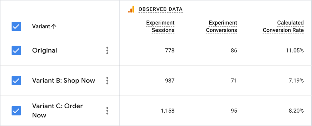
Winner: View Plans
View Plans: 11.05% CR
Order Now: 8.20% CR
Shop Now: 7.19% CR
Las Vegas Geo Page
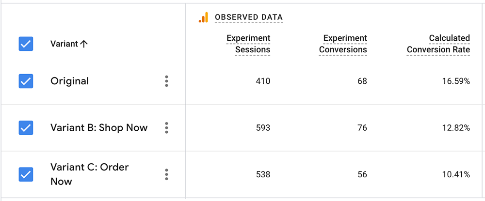
Winner: View Plans
View Plans: 16.59% CR
Shop Now: 12.82% CR
Order Now: 10.41% CR
DIRECTV Channel Lineup Page
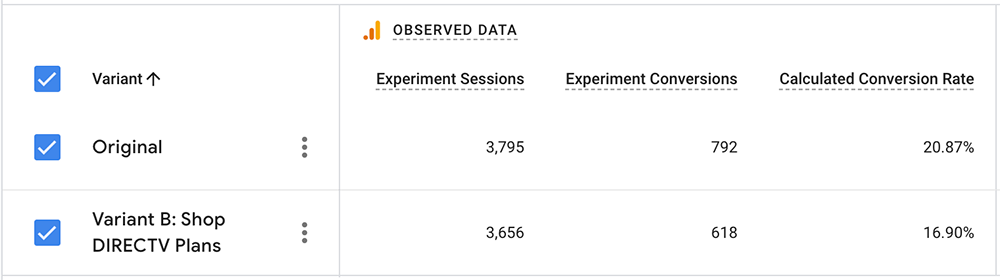
Winner: View Plans
View Plans: 20.87% CR
Shop DIRECTV Plans: 16.90% CR
Internet Without Phone Line Page
![Results of the A/B testing for the How to Get Internet Without a Phone Line page, showing the Shop [Provider] Plans label as the narrow winner with a 20% conversion rate.](../../images/cta-testing-internet-wo-phone-line.png)
Winner: Shop [Provider] Plans
Shop [Provider] Plans: 19.87% CR
View Plans: 19.67% CR
Best Streaming Services Page
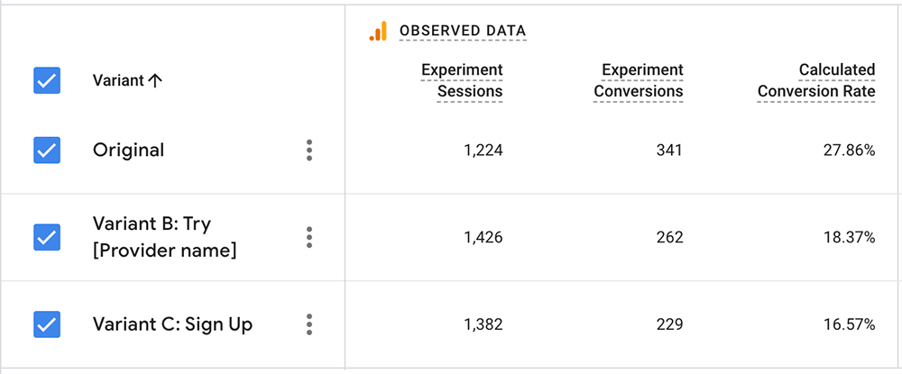
Winner: View Plans
View Plans: 27.86% CR
Try [Provider name]: 18.37% CR
Sign Up: 16.57% CR
A/B Testing Summary
The original, baseline A (“View Plans”), was the winner in 4 of the 5 tests.
- The largest discrepancy was on the “Best Streaming Services” page, with nearly a 10% gap between variant A and variant B’s conversion rates.
- The “How to Get Internet without Cable or a Phone Line” page was the only page where a variant “won” — but the margin was razor thin, at just 0.2%.
- The CTAs with the most direct, purchase-focused labels (Order Now and Sign Up) generally performed the poorest, with conversion rates of just 8.2%, 10.41%, and 16.57%.
- CTAs using labels that combined info-gathering with acquisition (Shop and Try language) performed at a higher rate, but still beneath the baseline.
Takeaway: Users Have an Information-Gathering Mindset

At first, I was surprised to see “View Plans” perform so well given its ambiguity. A closer examination, however, reveals a key finding.
The results indicate that users are most often coming to CableTV.com with information-gathering as their primary focus. They are most interested in learning more about the TV/internet/streaming plans and offers rather than wanting to make a purchase or sign up for an account right then and there.
Although “View Plans” lacks context and clarity, it is a less salesy prompt. For mid-to-high funnel pages in particular, this works well because it is less likely to discourage clicks from users in info-gathering mode.
Keeping the Status Quo
With results consistently showing its effectiveness for CTR, we decided to keep “View Plans” on our primary CTAs. Although it is not a perfect label, it sufficed in our situation to best balance the needs of the business with user intent.
Questions? Email me at nathanbrown.ux@gmail.com.