Content “above the fold” on a webpage—that is, the content seen at the top without the need to scroll—is critical for site messaging and conversion opportunities.
This content needs to do several things—catch the user's attention, convey accurate information about where they've landed, and provide the best opportunity to take action. For instance, on a top-funnel page meant to drive readership, above-the-fold (ATF) content needs to convince the user to keep scrolling and read what's below. On a bottom-funnel page meant for conversion, ATF content should convince the user to take action—most often by clicking a call-to-action (CTA) button.
A good way to assess the ATF content on your site is to audit your pages for it. I conducted a simple ATF content audit for the internet/TV provider pages of CableTV.com (CTV).
Above-The-Fold Content Audit Project Overview
Role
- UX Researcher/Auditor
Process
- Define ATF elements to audit
- Find average fold ranges
- Find user screen resolutions
- Assess presence/absence of ATF elements
- Determine next steps
Tools Used
- Google Sheets
- Google Analytics
- Mouseflow
- Tune
Objective
Define the conversion-focused content elements for internet/TV provider pages on CableTV.com and audit for the presence or absence of these elements above-the-fold on each page. After gathering these findings, prioritize which pages should have ATF element(s) added.
Audit Setup: Defining ATF Page Elements
Because this audit was for lower funnel pages—those in the internet/TV provider suite—I was interested in conversion-focused page elements above the fold. I first identified the seven elements commonly used above the fold on our pages to influence conversion:
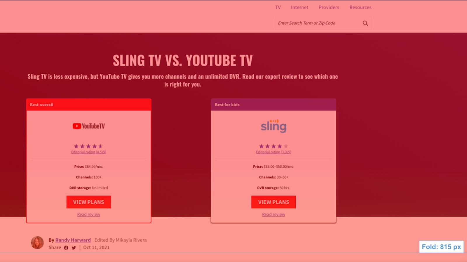
Subtitles
Subtitles are present on most of our pages. We use them to catch the reader's attention, provide additional page context, promote E-A-T (expertise, authoritativeness, trustworthiness), or encourage the user to take action.
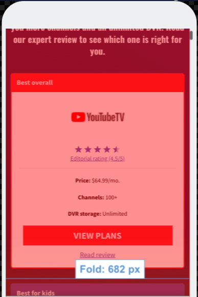
Hero cards
We use hero cards to provide a quick overview and comparison of internet/TV providers, along with a CTA button to take action. There may be anywhere from 2 to 5 cards hero cards above the fold of a page.
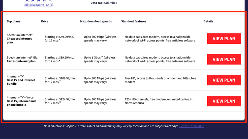
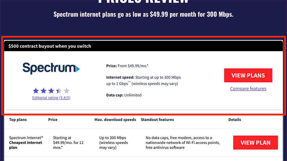
Hero table
The hero table shows a more detailed breakdown of provider information—often, this lists different plans or packages that a provider offers.
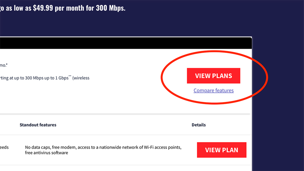
Call-to-action button
We use CTA buttons on both hero cards and hero tables. Most often, this is a “View Plans” button which leads to an external link on the provider's website.
Image/logo
Most of our hero cards include the logo of the internet/TV provider. The logo helps to reinforce the provider brand and the legitimacy of our review, while also providing an additional monetized click target.
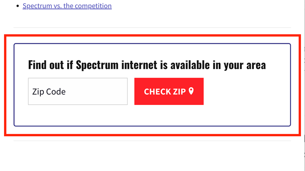
Zip code check
Zip code checks are one of our most commonly used elements, though they are most often below the fold. When a user enters their zip code, it redirects them to a page listing providers in their area.
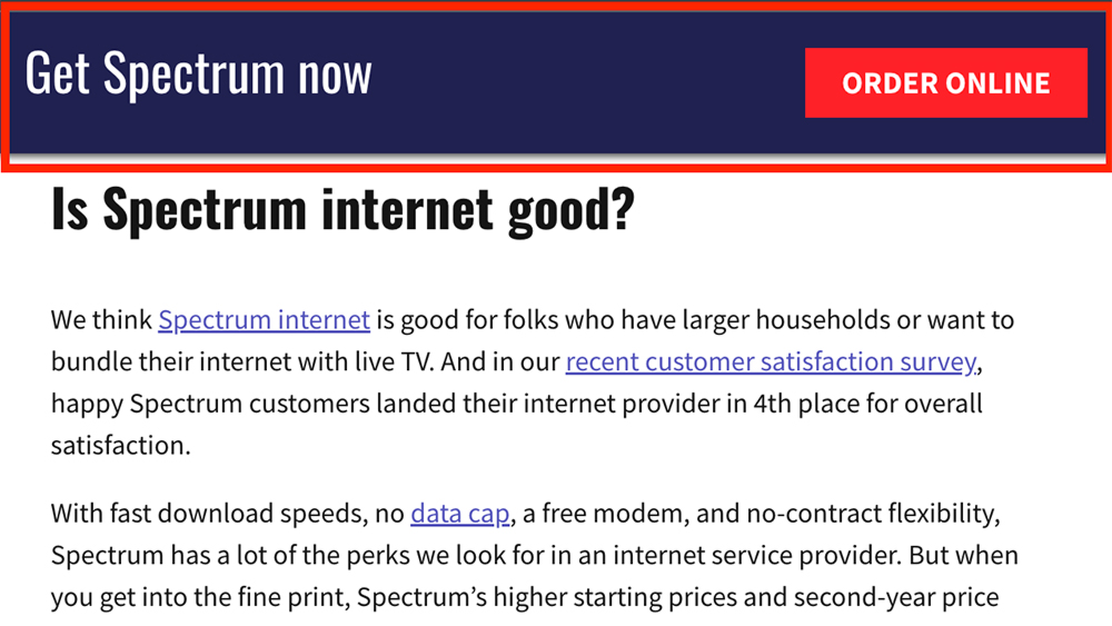
Sticky CTA
The Sticky CTA is a banner that remains fixed on the top of the screen as the user scrolls down. It contains a simple prompt (like “Get Spectrum now”) along with a phone number and/or CTA button.
Audit Setup: Analytics
Next, I ran heatmapping on Mouseflow to find the average fold depth of our pages. On average, ATF content is displayed between the first 750-900 pixels on desktop and the first 600-700 pixels on mobile.
For further context and understanding, I then used Google Analytics to find the most common screen resolutions of CTV users.
| Desktop | Mobile |
|---|---|
| 1920 x 1080 | 414 x 896 |
| 1366 x 768 | 375 x 812 |
| 1440 x 900 | 375 x 667 |
| 1536 x 864 | 390 x 844 |
| 1280 x 720 | 428 x 926 |
| 1600 x 900 | 414 x 736 |
| 1280 x 800 | 768 x 1024 |
Conducting the Audit
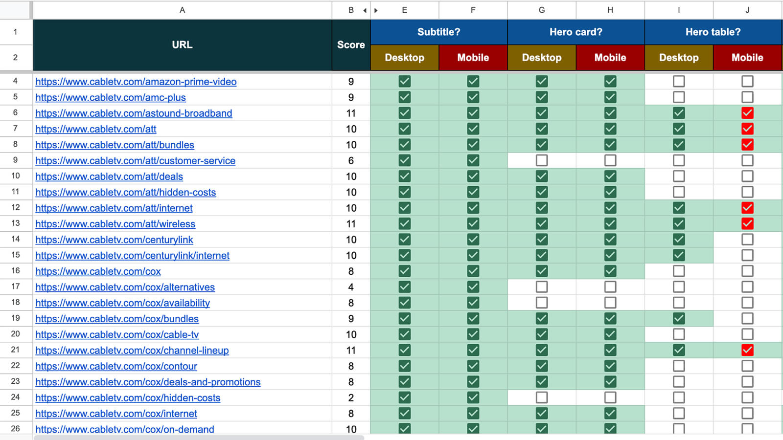
I devised a simple system to track ATF content in a Google Sheet: list each of the seven page elements and include a checkbox for both desktop and mobile. For each URL, open the page and see which elements are present above the fold (I even used a physical sticker to put on my screen to help me keep track of the average fold position!)
If the element was solidly present ATF, check the box green. If the element may or may not be present, depending on screen size, check the box red. If the element was clearly not present, leave the box unchecked.
I added a column for “score,” which was a running tally of the elements present. Each checkmark = 1 point.
As you can see from the screenshot below, the final result was an easily visualized matrix revealing the presence or absence of conversion elements above the fold.
(Click to see larger)
Adding in Revenue
To measure our core metric—revenue—I then used Tune (our revenue-tracking tool) to add in the revenue each page had generated. By comparing the revenue numbers side-by-side with the ATF score, I could quickly see whether or not a high score correlated to high revenue, and vice versa.
This chart shows a breakdown of the results:
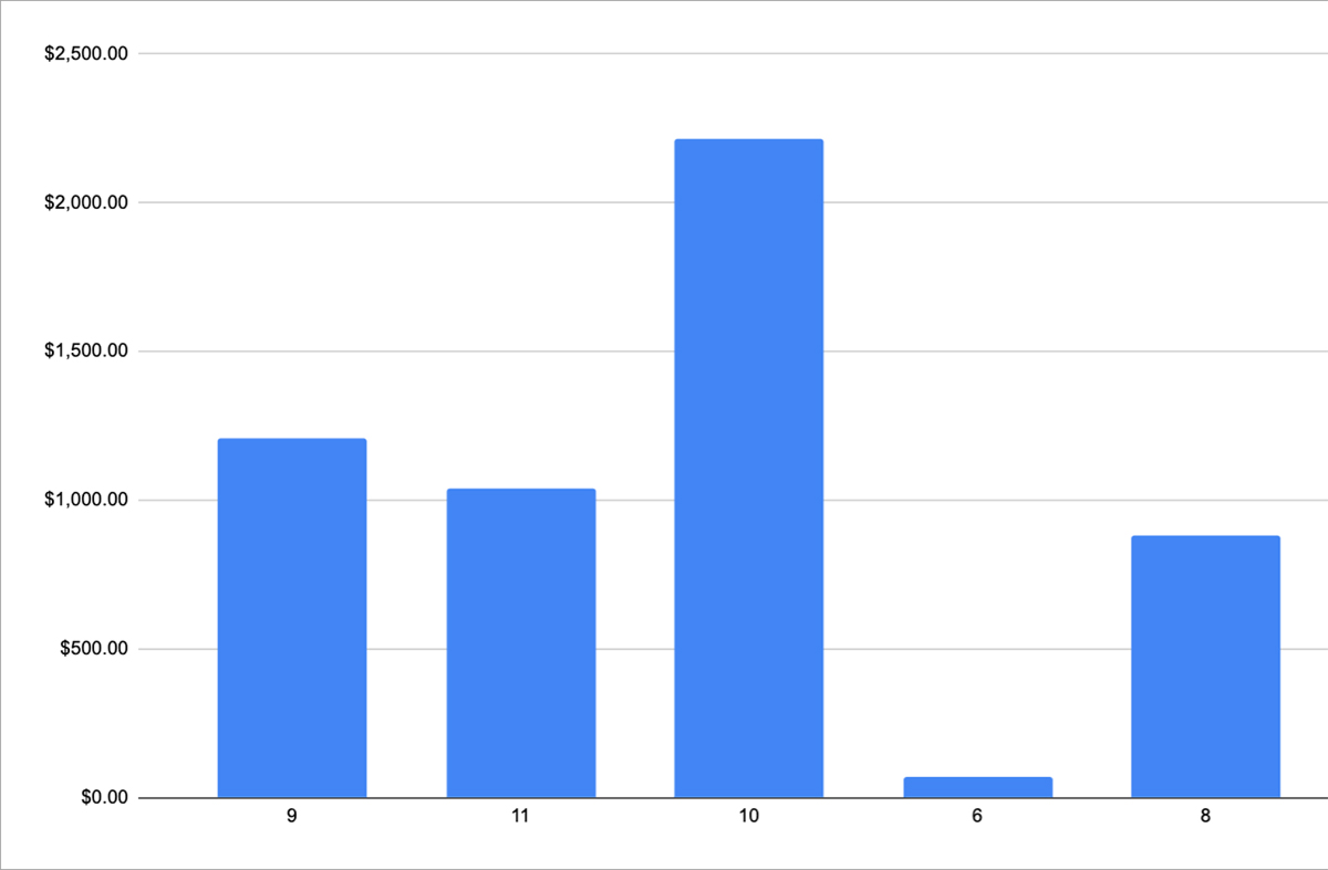
Not surprisingly, the pages with the highest ATF scores (8-11) also generated the most revenue.
Takeaways and Next Steps
The audit confirmed that more above-the-fold, conversion-focused content leads to higher revenue. It also revealed the pages which were lacking in ATF content. It was interesting to note that our zip code checks—a highly valuable conversion tool—were indeed absent above the fold on most pages.
Findings from the audit led to many possible next steps, including:
- Consider CTAs to be added to pages with a low ATF score
- Find a way to show a zip code check ATF
- Add a subtitle to pages missing it
- Add the Sticky CTA to pages missing it
- For pages without a hero card or table, assess whether adding one would make sense
- On pages where the main CTA is a text link, convert to a button
- A/B tests for things like subtitles, CTA labels, and hero card order

Our immediate actions focused on quick wins, such as adding in Sticky CTAs and converting text links to buttons, which both led to increased click-through rates. I also began experimenting with adding zip code checks high on the page, which proved to be an effective strategy as well.
The bottom line? Optimize your pages for what users see above the fold. Make sure that you capture their attention, convey accurate information about where they've landed, and provide the best opportunity for them to take action. Poor or misleading headlines/subtitles, irrelevant content, lack of CTAs, or excessive empty space can hurt engagement.
Questions? Email me at nathanbrown.ux@gmail.com.