A content map is a high-level visual representation of content on a website, built using a 'hub and spoke' model to arrange content together by topic.
The image below shows a zoomed-out view of the content map I built for CableTV.com (CTV):
(Click to see larger)
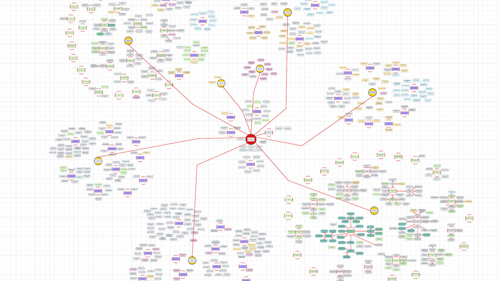
The topical organization is a key feature to note—the content map is not organized categorically; that is, it does not necessarily correspond to the actual information architecture of your site. By grouping content together topically, you can easily see how individual content pieces work together to build out your overall coverage of a particular topic.
What is a Content Map Used For?
Content maps can be used for a variety of purposes, including:
- To help with decision making in the content planning process.
Visualizing your content in this way, you can quickly see what topics you are content-heavy on and where the gaps are. - To see the relationships between content.
With the hub and spoke model, you can see how your content groups into logical topics and what ties it together. - As an internal linking resource.
By seeing the breadth of your content in one view and the connections in between, you can get an idea of where it makes sense to send users next from a particular piece. - To assist with information architecture projects.
By organizing your content into topical groups, you've essentially already completed one step of an IA project. These groupings can help form the basis for proposed site structure models. - As a tool for any number of content strategy initiatives.
Simply put, a content map can be a powerful tool any time you need to work on a project or task involving your content inventory. Scrolling across the map and quickly hopping from one content piece to the next is often much more efficient than clicking through individual cells/records in a spreadsheet or database.
How Do You Build a Content Map?
Since this article is intended to be a simple introduction to content maps, I won't cover in-depth setup here. But let's look at a quick overview of the process.
1. Set up and clean up your content inventory
Maintaining a robust content map relies on data linking between your content inventory and the mapping tool. Therefore, your content inventory needs to be up-to-date and contain all metadata fields you wish to include.
My team at CTV uses Airtable to maintain our content inventory. I highly recommend this tool for its in-depth content management capabilities and ability to integrate with other third-party services.
2. Create a Google Sheet to serve as the database for the map
Unless the mapping tool can pull data straight from your regular inventory (in this case, Airtable), you'll need a separate database of your content to pull from.
3. Set up data integration to import from Airtable to Google Sheets
Google Sheets can import data from Airable using a service like Coupler.io. You should set this up to run regularly—this way, the sheet will be kept up-to-date with your content inventory.
4. Link the Google Sheet to the mapping tool
You will need a diagramming tool or digital collaboration platform to create the content map. On CTV, we use Lucidchart, which provides data linking from external platforms like Google Sheets.
5. Build out the map
This is the biggest and most time-consuming step. Once all of the hoses have been connected with the data, Lucidchart (or the tool of your choice) will display a list of all your content imported from the Google Sheet. From here, you will need to create the shapes/formatting for building the map and then drag/drop each piece of content onto the shapes.
With each shape representing a content piece, you'll then arrange the shapes into the hub and spoke format while determining what should go where based on its topic.
For maximum benefit, you should set up conditional formatting so that shapes will automatically display a certain color, size, or border, etc., based on metadata from the content. For instance, you might set up a format that says any piece of content designated as a blog article will be the color blue. When the map is complete, having these different types of styling will help with the visualization of content and content types.
The building phase is the most intensive part of the process, depending on the size of your website. Once it is complete, however, you now have access to a tool with a variety of benefits to help you in your content strategy. The map will need to be kept up-to-date as you add and remove content from your website, so plan on doing manual upkeep. At least once a month is a good baseline, but this may vary depending on the frequency of new content published.
Content Map Demo
Check out this short demo of the content map I created for CTV:
As mentioned, this article is intended to be only an introduction and overview for content maps. If you have questions or would like to know more, please email me at nathanbrown.ux@gmail.com.