
With remote work and virtual meetings continuing to gain prominence, videoconferencing software faces stiff competition.
Platforms like Zoom, Google Meet, Microsoft Teams, Cisco Webex, and even Skype (yes, it’s still a thing) all vie to be your virtual communication tool of choice.
For many businesses and individual users alike, Zoom is their go-to platform for video calls. You may have never even heard of Zoom prior to 2020, when the COVID-19 pandemic prompted its explosion. But nowadays, Zoom is a household name and has come a long way since its beginnings more than a decade ago.
Over the years, Zoom has continued to enhance its platform with a number of both fun and useful features. Things like video filters, breakout rooms, background noise suppression, emoji reactions, screen annotation, and third-party app integrations have all been added to Zoom’s feature set in recent years.
While it seems like they’re always adding something new to make the platform better, I continue to find myself wishing that Zoom would make a few adjustments to improve the user experience of their product. Some of these are minor enhancements, while others are larger usability issues I routinely get frustrated with.
Here are six features to improve the UX of Zoom.
(Note: The features listed here refer specifically to the desktop version of Zoom.)
1. Natural Mapping of “Pin” Feature
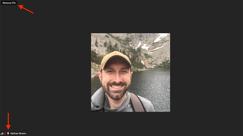
Zoom allows you to “pin” someone’s video tile to the screen—it makes their tile full screen and keeps it fixed for your viewing, regardless of who is speaking on the call. You pin someone by choosing the “Pin” option under the three-dot menu that appears when you hover over their tile.
Once they are pinned, a small pushpin icon appears in the bottom-left corner next to their name—a nice visual cue that you have them pinned. But for the longest time, I kept instinctively clicking on this pushpin icon when I wanted to unpin them. Why? Because that’s how I would do it in real life. When I want to remove a pin, I pull it out—clicking on this icon is the digital equivalent. However, that doesn’t work. To remove the pin, you must select the “Remove Pin” button that appears in the top-left corner.
I find it mildly annoying that the controls for this action are spread out like this. It would be more intuitive—and require less mouse movement—to keep the controls in the same location. “Push down” on the pin icon to pin someone, and “push up” to unpin them. Such a UI interaction would follow the laws of natural mapping in UX.
2. Fixed Emoji Reactions
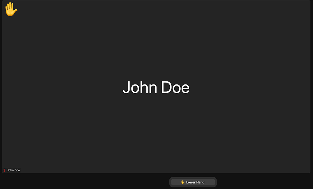
Zoom lets you “react” with emojis, which will briefly appear at the top of your video tile. It would be useful to have the option for emoji reactions to remain fixed on your screen rather than disappear after a few seconds. This could operate similarly to the “Raise Hand” feature, which adds a raised hand emoji on your video tile and stays there until you click “Lower Hand”.
I see a few benefits to this addition. One, it would give you the control to truly emphasize the reaction. Oftentimes, with dozens (or even hundreds) of participants in the room and many people looking away or viewing a shared screen, it’s easy to miss someone’s emoji reaction.
Second, it could be used as a fun or informal voting system. Rather than a “show of hands” that you might call for in an in-person meeting, you could ask for participants to add a certain emoji to their tile. While you could, of course, do this with the current setup, the fact the emoji disappears can make it difficult to track.
3. Fixed Status Messages
If a user turns their camera off, Zoom displays one of two options. If the user is signed in and has a profile photo set, it will display a static image of the photo. If not, it will just display a black screen with the user’s profile name.
I would love to have a third option here—to display a custom message on screen rather than just your name or photo. This would be convenient if you have to step away momentarily and want others on the call to be aware you are away. Or, perhaps you want to keep your camera off the entire time and want to explain why. No matter the reason, a custom message option would enhance the ability to passively communicate with others on the call.
4. See Who’s in a Call Before You Join
When you click on a “Join Zoom Meeting” link, you are thrust immediately into the meeting (unless the host has not yet started it or has the “waiting room” feature enabled). To me, this feels a lot like walking up to a closed meeting room door with no windows, opening the door and jumping right inside, without having any idea who is in the room or if the meeting has started.
To lessen the potential of a jarring experience, having a default waiting room (even if the host does not require one) would be a nice assist here. Users could land on a screen that specifies whether the meeting has started or not, as well as who is currently in the meeting. Google Meet has this feature, and it’s one of my favorites.
5. Audio Alert When Someone Joins a Call

When someone joins a Zoom call, there is no audible alert. On some platforms (see again, Google Meet), there is an alert sound when someone joins the call. This is a helpful feature to give you a heads up that someone has joined.
I’ll admit that sometimes not having the alert can be nice—namely, when you want to sneak into a meeting late without drawing attention to yourself. But for 1-on-1’s or other small meetings, this alert would really come in handy.
Oftentimes, if I join a 1-on-1 meeting first and am waiting on the other person, I want to minimize the Zoom call to work on other things while I wait. I find myself constantly having to switch back to the Zoom screen to check if the other person has joined. An audio cue would eliminate the need for these window gymnastics.
Because there are potential benefits to both having or not having this alert, it could have the option to be enabled/disabled by the host. Or, perhaps, it could be default for 1-on-1 meetings (or a participant number of your choosing) but absent on large calls.
6. Better Direct Messaging
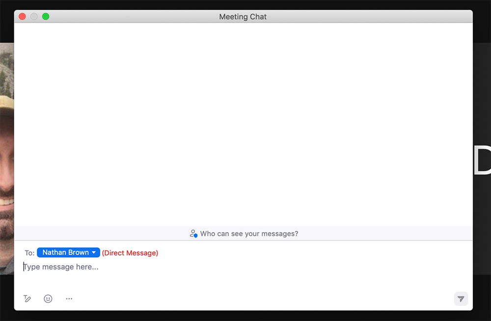
Last but not least—the feature that has frustrated me the most over the years. The direct messaging in Zoom is a classic example of poor UX design that can lead to mode error.
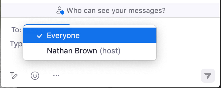
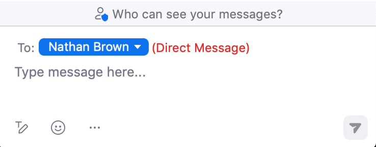
By default, the chat feature sends messages to everyone in the room. To send a direct message to one user, you must change the recipient designation under the “To:” dropdown menu.
The UI does display nicely contrasted red text next to the name indicating you have selected to send a direct message.
However, the fact that you share the same chat window with everyone and must change modes (select who the message recipient is) each time you send a chat is cumbersome and can easily lead to sending a message to the wrong person. Below are examples of two mistakes prone to happen—either accidentally sending a message to everyone instead of one person, or sending a message to one person that was meant for everyone.
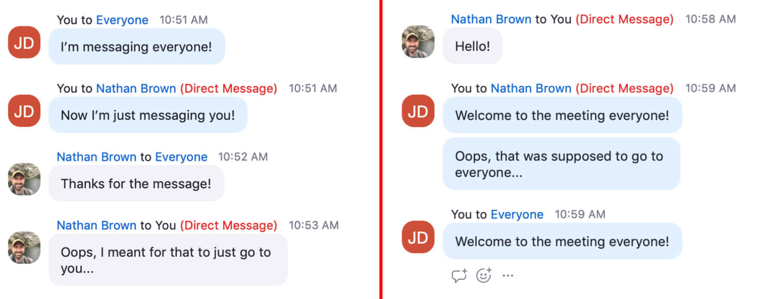
The latter is even more likely to happen, because when someone DMs you first, Zoom automatically sets your chat recipient to be that person. If you don’t notice, you may open the chat to message the group and send to that one person instead.
The constant mode switching while sharing a singular chat interface is, at the least, a clunky experience. Chat isn’t the heart of Zoom, so it’s likely this gets a pass from lack of heavy usage. But to streamline the experience, I would love an upgraded chat that functions closer to dedicated messaging platforms like Slack—separate chat windows for separate people.
Share this article with your followers: